From Data to Decisions: Why Layout Is Key in Power BI

In a data-driven world, the way we present information is just as important as the data itself. In the context of Power BI or any other visualization tool, a good layout can be the decisive factor between a report that generates valuable insights and one that leaves users confused or indifferent.
 Why Invest in a Good Layout?
An appealing layout is not just a matter of taste — it’s a strategic tool. When well applied, it improves clarity, reduces interpretation errors, and increases user engagement. A visually well-structured report guides the eye, highlights what is relevant, makes navigation and interpretation easier, and manages to capture attention for the first conclusions.
Requirements to build a good report
- Identify the audience
- Determine report types
- Define user interface requirements
- Define user experience requirements
- Explore report designs
What can make a difference
Clarity and Simplicity
- Reports with a clean and organized design help users focus on what matters.
- Avoiding excessive charts, colours, or unnecessary decorative elements allows for a more fluid and objective reading.
Visual Consistency
- Uniformity in the use of colours, fonts, and spacing creates a more professional and intuitive experience.
- Consistency facilitates navigation between pages and increases user trust.
Prioritize User Experience
- A good layout considers who will use the report. (Executives need clear and concise KPIs; analysts look for details and segmentations.)
- Applying reading patterns can improve analysis flow.
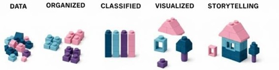
Storytelling with Data
- An effective layout tells a story, focus on the KPI’s, trends and alerts.
- Data should be presented logically, with titles, captions, and annotations that provide context.
Impact on Decision-Making
- Well-designed reports reduce the time needed to interpret data and make decisions.
- Confusing layouts can lead to incorrect conclusions or delays in action.
Investing in a good layout in Power BI or other tool means investing in effective data communication. An appealing design not only improves aesthetics but also clarifies concepts, trust, and action. In a business environment where every decision counts, layout can be the differentiator between success and uncertainty.
Sources:
https://learn.microsoft.com/en-us/training/paths/power-bi-effective/
by Inês Portela, Power BI Consultant at Luza